 Prev Next Prev Next  |
 Print
Print
The Sitecore.Web.UI.HtmlControls namespace contains a large number of ready-to-use out-of-the-box controls. We will experiment a little and add a few simple ones and then learn how to position them.
Explore the HtmlControls namespace to see all of the controls. There are dozens of them, so we will focus on the most important ones.
4.1. Adding Controls
To add a control to a page, you simply need to add the corresponding tag to the layout. This section shows how to add a few simple controls.
4.1.1. Literal
Literal is a simple text container. The only property named ‘Text’ holds the actual text.
Example:
4.1.2. Edit
Edit control is the Textbox analogue. It has three properties:
| Property Name | Meaning |
| Hidden | Enables or disables visibility of the control |
| Password | When set to true, content will be masked with asterisks (used to input passwords) |
| Value | Holds the literal contents of the control. |
Example:
4.1.3. Checkbox
Checkbox is another widely used control.
| Property Name | Meaning |
| Checked | Whether the checkbox is checked or not |
| Header | Literal description that will be rendered near the checkbox |
| HeaderStyle | Style that will be applied to the Header |
| Value | Literal value of the checkbox. “1” if checkbox is checked, empty string if it's not |
| Click | Method to invoke when the checkbox is clicked |
Example:
4.2. Control Layout
Adding controls is simple, but to add them in the right places we need to learn how to define positioning in XAML.
4.2.1. GridPanel
We’ll use the Sitecore.Web.UI.WebControls.GridPanel control as a container for the rest of the controls on our page. GridPanel renders to html as a table, with each of its children in a separate row, thus embedding each control in <tr><td></td></tr> tag constructions.
Note: You can use the ‘Columns’ property of the GridPanel to define the table. If you need three columns, simply add Columns=”3” in the GridPanel tag.
<Literal Text="My very own XAML app!" />
</GridPanel>
The above structure will be translated to:
<tr>
<td>My very own XAML app!</td>
</tr>
</table>
The class property in the GridPanel sets CSS class for the HTML table. The remaining properties mirror their HTML table counterparts as well.
4.2.2. Border
To align the text, let’s use another container control – Border. Border renders as a simple <div>[children]</div> block and allows you to separate one or several controls from the others (perhaps to apply some special style to it).
<Border align="Center">
<Literal Text="My very own XAML app!" />
</Border>
</GridPanel>
By adding the Border control, we’ve changed our only table cell from:
to:
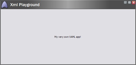
At this point your layout should look similar to this:
<FormPage>
<CodeBeside Type="FirstXamlExample.XmlPlaygroundForm,FirstXamlExample.dll"/>
<GridPanel class="scBackground" vAlign="top" Height="100%" Width="100%" Cellpadding="5">
<Border align="Center">
<Literal Text="My very own XAML app!" />
</Border>
</GridPanel>
</FormPage>
</XmlPlayground>
</control>
Start the application again (or instead of opening a new window, you can use Ctrl+RightClick and select Refresh from the context menu).
4.2.3. Space
Many developers are familiar with the technique of inserting 1px blank images and sizing them to the needed size to tweak the document layout. The Space control is used exactly for this purpose. Let’s insert another literal inside the border:
<Literal Text="My very own XAML app!" />
<Literal Text="Looks easy" />
</Border>
That would result in the second literal being placed right after the first one without any space between them. Of course, you can use other techniques to separate the content, like adding a column or using CSS styles, but often a blank image is a fast and effective solution. Add the Space control between the two literals:
<Literal Text="My very own XAML app!" />
<Space Width="32px" />
<Literal Text="Looks easy" />
</Border>
The resulting application is shown below.
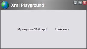
The generated html markup is:
<div align="Center">
My very own XAML app!
<img src="/SdnArchive/sitecore/images/blank.gif" border="0" alt="" width="32" height="1" align="absmiddle"/>
Looks easy
</div>
</td>
Note: You can also use the Height property of the Space control if desired.
Prev Next